

Investment Diversification Reduces Risk
Investment diversification is an important tool that many investors used to reduce risk. Last week, I explained diversification and how it is related to correlation. In this post, I’ll illustrate different ways you can use investment diversification and provide illustrations of its benefits.
Investment Diversification: Key Take-Aways
Here are some key take-aways about investment diversification.
Diversification reduces risk, but does not change the average return of a portfolio. The average return will always be the weighted average of the returns on the financial instruments in the portfolio, where the weights are the relative amounts of each instrument owned. Be careful to remember this point. It is important and some charts on diversification can be misleading.
The smaller the correlation among financial instruments (all the way down to -100%), the greater the benefit of diversification. Check out last week’s post for more about this point.
Diversification can be accomplished by investing in more than one asset class, more than one company within an asset class or for long periods of time. One of the easiest ways to become diversified across companies is to purchase a mutual fund or exchange traded fund. Funds that focus on one industry will be less diversified than funds that includes companies from more than one industry.
Diversification reduces risk, but doesn’t prevent losses. If all of the financial instruments in a portfolio go down in value, the total portfolio value will decrease. Also, if one financial instrument loses a lot of value, the loss may more than offset any gains in other instruments in the portfolio.
A diversification strategy can be very risky if you purchase something without the necessary expertise to select it or without understanding all of the costs of ownership.
I’ll explain these points in more detail in the rest of the post.
Diversification and Returns
The purpose of diversification is to reduce risk. It has no impact on return. The total return of any combination of financial instruments will always be the weighted average of the returns on the individual financial instruments, where the weights are the amounts of each instrument you own. For example, if you own $3,000 of a financial instrument with a return of 5% and $7,000 of a different financial instrument with a return of 15%, your total return will be 12% (=[{$3,000 x 5% + $7,000 x 15%} = {$150 + $1,050}]/$10,000 = $1,200/$10,000). Similarly, two instruments that both return 10% will have a combined return of 10% regardless of how correlated they are, even -100% correlation.
Investment Diversification among Asset Classes
When investing, many people diversify their portfolios by investing in different asset classes. The most common of these approaches is to allocate part of their portfolio to stocks or equity mutual funds and part to bonds or bond mutual funds. These allocation approaches require that the portfolio be re-balanced on a regular basis to maintain the target asset allocation.
Correlation between Stocks and Bonds
Two very common asset classes for personal investment are bonds and stocks. Click here to learn more about bonds, including a comparison between stocks and bonds. Click here to learn more about stocks.
The Theory
The prices of stocks and bonds sometimes move in the same direction and sometimes move in opposite directions. In good economies, companies make a lot of money and interest rates are often low. When companies make money, their stock prices tend to increase. When interest rates are low, bond prices are high.[1] So, in good economies, we often see stock and bond prices move in the same direction.However, from 1977 through 1981, bond prices went down while stocks went up. At the time, the economy was coming out of a recession (which means stock prices started out low and then rose), but inflation increased. When inflation increases, interest rates tend to also increase and bond prices go down. [2]
Correlation of S&P 500 and Interest Rates
Over the past 40 years, interest rates have generally decreased (meaning bond prices went up) and stock markets increased in more years than not, as shown in the graph below.

The blue line shows the amount of money you would have each year if you invested $100 in the S&P 500 in 1980. The green line shows the interest rate on the 10-year US treasury note, with the scale being on the right side of the graph. Because bond prices go up when interest rates go down, we anticipate that there will be positive correlation between stock and bond prices over this period. If we looked at a longer time period, the correlation would still be positive, but not quite as high because, as mentioned above, there were periods when bond prices went down and stock prices increased.
Historical Correlation of Stocks and Bonds
I will use annual returns on the S&P 500 and the Fidelity Investment Grade Bond Fund to illustrate the correlation between stocks and bonds. The graph below is a scatter plot of the annual returns on these two financial instruments from 1980 through 2018.

The returns on the bond fund are shown on the x axis; the returns on the S&P 500, the y axis. Over this time period, the correlation between the returns on these two financial instruments is 43%. This correlation is close to the +50% correlation illustrated in one of the scatter plots in last week’s post. Not surprisingly, this graph looks somewhat similar to the +50% correlation graph in that post.
Stock and Bond Returns and Volatility
Recall that diversification is the reduction of risk, in this case, by owning both stocks and bonds. The table below sets the baseline from which I will measure the diversification benefit. It summarizes the average returns and standard deviations of the annual returns on the S&P 500 (a measure of stock returns) and a bond fund (an approximation of bond returns) from 1980 to 2018. The bond fund has a lower return and less volatility, as shown by the lower average and standard deviation, than the S&P 500.

Diversification Benefit from Stocks and Bonds
The graph below is a box & whisker plot showing the volatility of each of these financial instruments separately (the boxes on the far left and far right) and portfolios containing different combinations of them. (See my post on risk for an explanation of how to read this chart.)

In this graph, the boxes represent the 25th to the 75th percentiles. The whiskers correspond to the 5th to 95th percentiles. As the portfolios have increasing amounts of stocks, the total return and volatility increase.
Diversification Benefit from Stocks and Bonds - A Different Perspective
These results can also be shown on a scatter plot, as shown in the graph below. In this case, the x or horizontal axis shows the average return for each portfolio. The y or vertical axis shows the percentage of the time that the return was negative. (See my post on making financial decisions for an explanation of optimal choices.)

There are three pairs of portfolios that have the same percentage of years with a negative return, but the one with more stocks in each pair has a higher return. For example, about 24% of the time the portfolios with 30% and 50% invested in bonds had negative returns. The 30% bond portfolio returned 8.9% on average, whereas the 50% bond portfolio returned 8.5% on average. Therefore, the portfolio with 30% bonds is preferred over the one with 50% bonds using these metrics because it has the same probability of a negative return but a higher average return.
How to Pick your Mix Between Stocks and Bonds
The choice of mix between stocks and bonds depends on how much return you need to earn to meet your financial goals and how much volatility you are willing to tolerate. A goal of maximizing return without regard to risk is consistent with one of the portfolios with no bonds or only a very small percentage of them. At the other extreme, a portfolio with a high percentage (possibly as much as 100%) of bonds is consistent with a goal of minimizing the chance of losing money in any one year. The options in the middle are consistent with objectives that combine attaining a higher return and reducing risk.Another approach is to use one of the asset allocations advocated by others. There is the three-fund portfolio, the four-fund portfolio, the Swensen portfolio and the All Seasons portfolio, among others.
Other Asset Classes
There are many other asset classes that can be used for investment diversification. Some people prefer tangible assets, such as gold, real estate, mineral rights (including oil and gas) or fine art, while others use a wider variety of financial instruments, such as options or futures. When considering tangible assets, it is important to consider not only the possible appreciation in value but also the costs of owning them which can significantly reduce your total return. Examples of costs of ownership include storage for gold and maintenance, insurance and property taxes for real estate. All of the alternate investments I’ve mentioned, other than gold, also require expertise to increase the likelihood of getting appreciation from your investment. Not everyone can identify the next Picasso!
Investment Diversification across Companies within an Asset Class
One of the most common applications of diversification is to invest in more than one company’s stock. It is even better if the companies are spread across different industries. The greatest benefit from diversification is gained by investing in companies with low or negative correlation. Common factors often drive the stock price changes for companies within a single industry, so they tend to show fairly high positive correlation.
Diversification across industries is so important that Jim Cramer has a segment on his show, Mad Money, called “Am I Diversified?” In it, callers tell him the five companies in which they own the most stock and he tells them whether they are diversified based on the industries in which the companies fall.
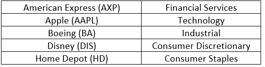
To illustrate the benefits of diversification across companies, I have chosen five companies that are part of the Dow Jones Industrial Average (an index commonly used to measure stock market performance composed of 30 very large companies). These companies and their industries are:
Correlation Between Companies
The graph below shows the correlations in the annual prices changes across these companies.

The highest correlations are between American Express and each of Boeing and Disney (both between 50% and 55%). The lowest correlation is between Apple and Boeing (about 10%).
The graph below shows a box & whisker plot of the annual returns of these companies’ stocks.

All of the companies have about a 25% chance (the bottom of the box) of having a negative return in one year. That is, if you owned any one of these stocks for one calendar year between 1983 and 2018, you had a 25% chance that you would have lost money on your investment.
Adding Companies Reduces Risk
The graph below shows a box & whisker chart showing how your volatility and risk would have been reduced if you had owned just Apple and then added equal amounts of the other stocks successively until, in the far-right box, you owned all five stocks.

The distance between the tops and bottoms of the whiskers get smaller as each stock is added to the mix. If you had owned equal amounts of all five stocks for any one calendar year in this time period, you would have lost money in 19% of the years instead of 25%. The 25th percentile (bottom of the box) increases from between -5% and 0% for each stock individually to +14% if you owned all five stocks. That is, 75% of the time, your return would have been greater than +14% if you had owned all 5 stocks.
As always, I remind you that past returns are not necessarily indicative of future returns. I used these five companies’ stocks for illustration and do not intend to imply that I recommend buying them (or not).
Investment Diversification Doesn’t Prevent Losses
The above illustration makes investing look great! Wouldn’t it be nice if 75% of the time you could earn a return of at least 14% just by purchasing five stocks in different industries? That result was lucky on my part. I looked at the list of companies in the Dow Jones Industrial Average and picked the first five in alphabetical order that I thought were well known and in different industries. It turns out that, over the time period from 1983 through 2018, all of those stocks did very well. Their average annual returns ranged from 19% (Disney) to 40% (Apple). The Dow Jones Industrial Average, by comparison, had an average return of 10%. That means that most of the other stocks in the Average had a much lower return.
Being diversified won’t prevent losses, but it reduces them when one company experiences significant financial trouble or goes bankrupt. Here’s a recent example.
Pacific Gas and Electric
Pacific Gas and Electric (PG&E) is a California utility that conservative investors have bought for many, many years. I’ve added it to the box & whisker plot of the companies above in the graph below.

PG&E’s average return (10%) is lower than the other five stocks and about equal to the Dow Jones Industrial Average. Its volatility is similar to Boeing and Disney as shown by the height of its box and spread of it whiskers being similar to those of the other two stocks.However, on the day I am writing this post, PG&E declared bankruptcy. PG&E has been accused of starting a number of large wildfires in California as the result of allegedly poor maintenance of its power lines and insufficient trimming of trees near them. Here is a plot of its daily stock price over the past 12 months.

In the year ending January 26, 2019, PG&E’s stock price decreased by 72%. From its high in early November 2018 to its low in January 2019, it dropped by 87%.
How to Reduce the Impact of Another PG&E
Although diversification can’t completely protect you from such large losses, it can reduce their impact especially if you are invested in companies in different industries. If the only company in which you owned stock was PG&E, you would have lost 72% of your savings in one year. If, on the other hand, you had owned an equal amount of a second stock that performed the same as the Dow Jones Industrial Average over the same time period (-6%), you would have lost 39%. The graph below shows how much you would have lost for different numbers of other companies in your portfolio.

This graph shows how quickly the adverse impact of one stock can be offset by including other companies in a portfolio. In a portfolio of five stocks (PG&E and four others that performed the same as the Dow), the 72% loss is reduced to about a 20% loss. With 20 stocks, the loss is reduced to 10% (not much worse than the -6% for the Dow Jones Industrial Average).
Investment Diversification Over Time
Another way to benefit from diversification is to own financial instruments for a long time. In all of the examples above, I illustrated the risk of holding financial instruments for one year at a time. Many financial instruments have ups and downs, but tend to generally follow an upward trend. The volatility and risk of the average annual return of these instruments will decrease the longer they are held.
20-Year Illustration
For illustration of the diversification benefit of time, I have used returns on the S&P 500. The graph below shows the volatility of the average annual return on the S&P 500 for various time periods ranging from one to twenty years.

To create the “20 Years” box and whiskers in this graph, I started by identifying all 20-year periods starting from 1950 through the one starting in 1997. I calculated the average annual return for each 20-year period. I then determined the percentiles needed to create this graph. The values for the shorter time periods were calculated in the same manner.The average return over all years is about 8.8%. Because we are using data from 1950 to 2018 for all of these calculations, the average doesn’t change.
The benefits of long-term investing are clear from this graph. There were no 20-year periods that had a negative return, whereas the one-year return was negative 25% of the time.
More Complicated Example
My post about whether Chris should pay off his mortgage provides a bit more complicated application of the same concepts. In that case, Chris puts money into the account for five years and then withdraws it for either the next five years or the next 21 years. The longer he invests, the more likely he is to be better off investing instead of paying off his mortgage.
A Caution about Individual Stocks
As a reminder, it is important to remember that this concept applies well to financial measures such as mutual funds, exchange-traded funds and indexes. It also applies to the financial instruments of many companies, but not all. If a company starts a downward trend, especially if it is on the way to bankruptcy, it will show a negative return no matter how long you own it. If you choose to own stocks of individual companies, you will want to monitor their underlying financial performance (a topic for a future post) and news about them to minimize the chance that you continue to own them through a permanent downward trend.
[1]The price of a bond is the present value of the future interest and principal payments using the interest rate on the date the calculation is performed. That is, each payment is divided by (1+today’s interest rate)^(time until payment is made). Because the denominator gets bigger as the interest rate goes up, the present value of each payment goes down. I’ll talk more about this in a future post on bonds.
[2]An explanation of the link between inflation and interest rates is quite complicated. I’ll write about it at some point in the future. For now, I’ll just observe that they tend to increase at the same time.


