
Financial Decisions - Risk and Reward
Almost every financial decision is a trade-off between reward and risk. In this post, I’ll use three examples to illustrate how financial decisions can be made in a risk-reward framework. The examples are:
Deciding what to buy with some extra money.
Selecting a deductible for your homeowners insurance.
Choosing to invest in a bond fund, an S&P 500 index fund or the stock of a single company. I’ll use Apple as the example for the single company.
Trade-offs in General
Almost all financial decisions involve some sort of a trade-off. In this post, I used statistical metrics (e.g., standard deviation, probabilities and percentiles) to define risk. Many financially savvy people use those types of metrics. To get you more comfortable with the idea of this type of trade-off, I’ll use a subjective measure for the first example – deciding what to buy with some extra money. I’ll then use statistical measures for the other two examples.
Trade-off – Purchase Example
Let’s assume your grandparents or parents gave you $1,000 for some special occasion, such as a graduation, birthday, or marriage. You have decided to spend the money in one of the following ways.
Spend $1,000 on a ski weekend.
Buy a new Xbox and some games for $500.
Spend $700 on clothes.
Get the latest iPhone for $1,000.
Don’t spend any of it.
You plan to put any money you don’t spend in your Roth Individual Retirement Account (IRA) or Tax-Free Savings Account (TFSA).In this example, I’ll define the trade-off as being between how much you enjoy your new purchase and its cost. You rank each option on a scale from 0 to 5 based on how much you will enjoy it. You’ll want to consider the great feeling you’ll get from putting money in your IRA or TFSA, knowing that it will lead to an enjoyable retirement, as part of how much you will enjoy the options that include a contribution.The table below might reflect your rankings:
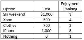
Your first inclination might be to select the iPhone because it will give you the most enjoyment. However, that doesn’t take into account the fact that it costs more than the Xbox and clothes. Clearly, though, you prefer the iPhone to the ski weekend because you get more enjoyment for the same cost.
I always find it much easier to understand data in a graph than in a table. The graph below shows the data above.

The x-axis (the horizontal one) represents the reduction in how much money you have after buying each item. That is, it is the negative of the cost of each purchase. The y-axis (the vertical one) shows how much you like each item. In this graph, you prefer things that are either up (higher ranking) or to the right (less cost).
Efficient Frontier Chart
The graph above is called a scatter plot.
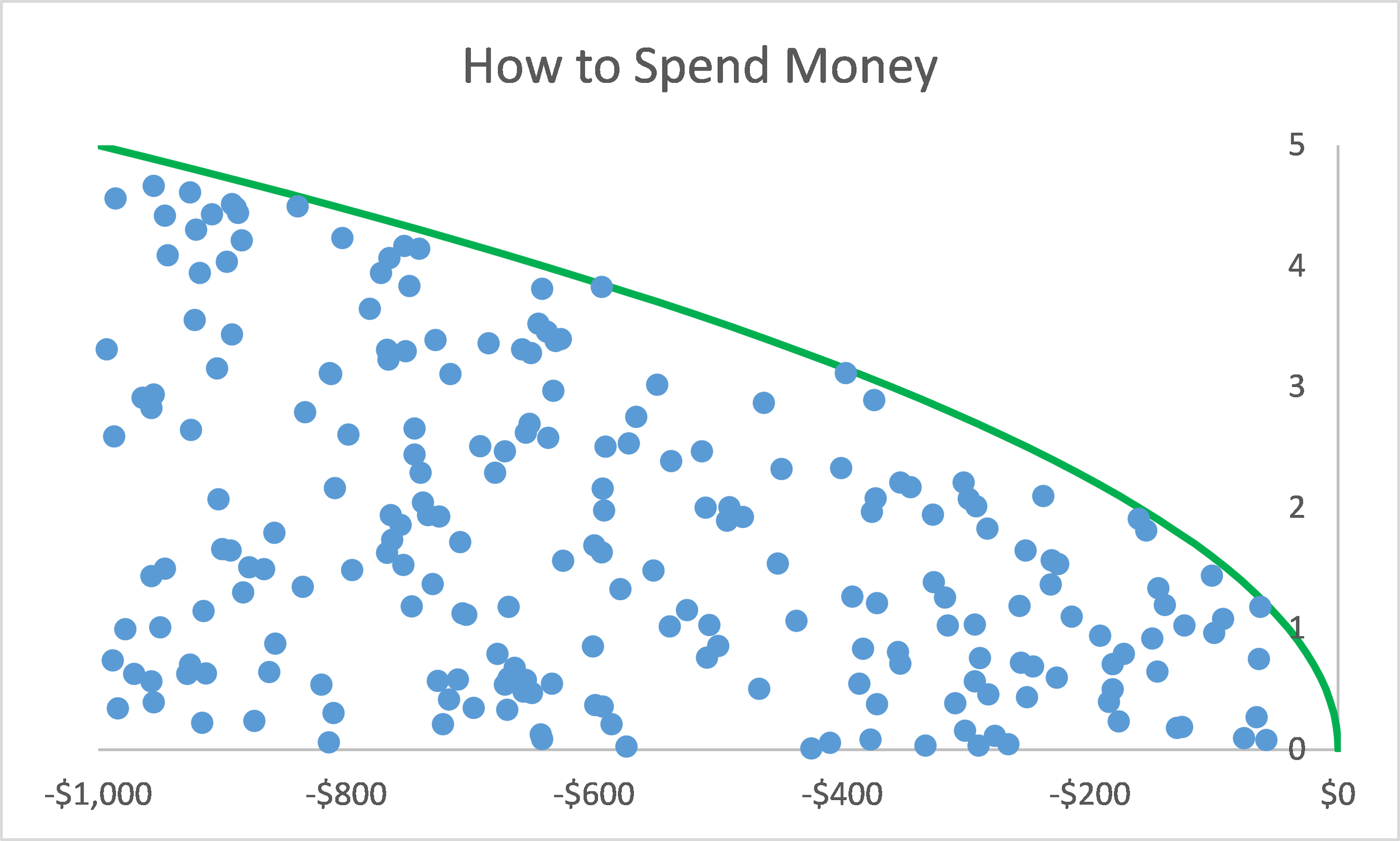
In theory, there are dozens of things that you could buy, such as is shown in the graph below.The blue dots in this graph represent the cost and your level of enjoyment of all of the options. The green line is called the “efficient frontier.” It connects all of the points the meet the following criteria:
There are no other purchases with the same cost that you enjoy more.
There are no other purchases with the same level of enjoyment that cost less.
Making Your Choice
The “best” choices are those that fall along the efficient frontier. You can reject any choices that aren’t on the efficient frontier as being less than optimal.
Going back to the first example, I added an approximation of the location of the efficient frontier based on the five points on the graph.

From this graph, we can see that any of buying the iPhone, buying the Xbox and some games or buying nothing are “optimal” decisions because they are on the efficient frontier. That is, while the ski weekend has the same cost as the iPhone, you rated it as providing less enjoyment so the ski weekend is not optimal. The clothes option is both more expensive and provides less enjoyment than the Xbox option, so it is also not optimal.
In this example, I have used the change in your financial position as the measure of “risk” and your level of enjoyment as the measure of “reward.” Your own evaluation of the trade-off between risk and reward will determine which of the options you choose from the ones on the efficient frontier.
This example was intentionally simplistic to introduce the concepts. I will now apply these concepts to two more traditional financial decisions – the choice of deductible on your homeowners (or condo-owners or renters) insurance policy and your first investment choice. My post about whether Chris should pay off his mortgage provides an even more complicated example.
Financial Risk & Reward Trade-Offs – Insurance Deductible Example
In this example, you are deciding which insurer and what deductible to select on your homeowners insurance. For this illustration, I have assumed that your house is insured for $250,000 and you have a $500,000 limit of liability. You have gotten quotes from two insurers for deductibles of $500, $1,000 and $5,000. As discussed in my post on Homeowners insurance, the deductible applies to only the property damage coverage and not liability.
For reward, I will use the average net cost of your coverage. That is, I will take the average amount of losses paid by the insurer and subtract the premium. Because the insurer has expenses and a profit margin, this quantity will be a negative number. Larger values (i.e., those that are less negative) are better (less cost to you).
For risk, I will use the total cost to you if your home has a loss of more than $5,000. Your total cost is zero minus the sum of your deductible and your premium. This number is negative (because outflows reduce your financial position) and larger (less negative) values are better.The table below summarizes the six options and shows the premium, reward (average net cost) and risk (total cost if you have a large claim) metrics for each one.
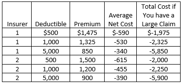
For each insurer, the premium and absolute value of your net cost decrease as the deductible increases. The total cost if you have a large claim, though, increases as the deductible increases. When converted to financial outflows, the total cost values get larger (less negative) as the deductible goes up.
Efficient Frontier Chart
For the $500 and $5,000 deductibles, Insurer 1 has a better price. For the $1,000 deductible, Insurer 2 has a better price. These relationships can also be seen in the scatter plot below.

As with the scatter plot for the first example, points that are up and to the right are better than those that are down and to the left. In this case, the efficient frontier connects the $500 and $5,000 deductible options for Insurer 1 and the $1,000 deductible option for Insurer 2.
Making Your Choice
Your choice among the three points on the efficient frontier is one of personal risk preference and your financial situation. The $5,000 deductible option is clearly the least expensive on average, but you would need to be willing and able to spend an extra $4,000 if you had a large claim, as compared to the $1,000 deductible policy. If you don’t have $5,000 in savings available to cover your deductible, that choice is not an option for you.
When I look at this chart, I notice that there is a fairly large reduction in the net cost from Insurer 1’s $500 deductible quote to Insurer 2’s $1,000 deductible quote. If I have the extra $500 in savings to cover a loss if I have a claim, that looks like a good choice. But, again, it is up to you to consider your finances and risk tolerance.
Financial Risk & Reward Trade-Offs – Investment Example
The same type of analysis can be used to evaluate different investment options. As long as you are looking at publicly traded stocks, ETFs, mutual funds or one of several other financial instruments, you can get lots of data about historical returns from Yahoo Finance. It is important to remember to let the historical data INFORM your decision, as the past is not always a good predictor of the future when looking at financial returns.
How to Get Data
Here is how I use Yahoo Finance to get data.
Go to finance.yahoo.com.
Find the Quote Lookup box. When I go to that site, it is usually on the right side of the screen below the scroller with the returns on various indices.
Type the symbol for the financial instrument for which I’m seeking data. Every publicly traded financial instrument has a symbol. For example, Apple is AAPL and the S&P 500 is ^GSPC. I can also enter the name of the company or instrument, though it isn’t always the best at finding the one I want. If the lookup doesn’t work very well, I use Google for the symbol of the company or financial instrument.
Click on the Historical Data button just above the graph with the stock price.
Select the time period over which you want the data in the pull-down box on the left. I usually want the full time series, so select Max.
Select the frequency on the right. I tend to be a long-term investor, so I always select Monthly.
Hit the Apply button just to the right of the frequency selection.
Hit Download Data just below the Apply button. It will ask you the format in which you want the data. I always select Excel. You’ll get a spreadsheet with one tab with your data on it.
There will be several columns in the spreadsheet that downloads from Yahoo Finance. I usually use the Date and Adjusted Close columns. Stocks can split (meaning you get more shares but they are worth less) and companies can issues dividends (which mean you get cash). If I just look at the closing price at the end of each month, it won’t reflect splits. Since I’m interested in total return, I want my data to reflect the benefit of dividends. The Adjusted Close column adjusts the closing stock price for both splits and dividends.
Investment Choices
In this example, we will assume that you have $10,000 you want to invest. To keep the analysis somewhat simple, we will also assume that you are going to buy only one financial instrument. Here are links to more information about diversification and the benefits of buying more than one financial instrument. The choices you consider are:
An S&P 500 index fund – an exchange-traded fund or mutual fund that is intended to produce returns similar to the S&P 500. Symbol on Yahoo Finance is ^GSPC
A Nasdaq composite index fund – an exchange-traded fund or mutual fund that is intended to produce returns similar to the Nasdaq composite. Symbol on Yahoo Finance is ^IXIC.
Fidelity investment grade bond fund – a Fidelity-managed mutual fund that invests in a basket of high-quality corporate bonds. Symbol on Yahoo Finance is FBNDX.
Tweedy Browne Global Value Fund – a mutual fund that focuses on international stocks.Symbol is TBGVX.
Boeing – A manufacturer of commercial and military aircraft. Boeing’s stock symbol is BA. For more information about stocks, check out this post.
Apple – No need to explain this one! Its stock symbol is AAPL.
Neogen – A small company that develops and sells tests of food for pathogens. Stock symbol is NEOG.
Riskiness of Choices
Here is a box and whisker plot of the risk of these seven options. See my previous post for a discussion of risk and box and whisker plots.In addition to showing the 5th, 25th, 75th and 95th percentiles, I added a blue horizontal line showing the average return over the 15-year time period for each investment.

Risk Metric – Standard Deviation
For most financial decisions, I look at the average result (e.g., average cost, average return, etc.) as my measure of reward. As illustrated in the first example, you can use any measure you want, including a subjective one like how much you will enjoy something. There are many, many risk metrics from which to choose. If you are interested in overall volatility (deviations both up and down from the average), standard deviation is a good metric.
The chart below show the scatter plot of these investments using the average return as the reward metric and standard deviation as the risk metric.

In this plot, points to the right are better because they represent higher reward. Points that are LOWER are also better, because they correspond to less risk. I’ve drawn the efficient frontier for these points as being the ones that are furthest to the right and lowest on the chart. Using these two metrics, the bond fund, Tweedy Browne (the international mutual fund), Boeing and Apple are on the efficient frontier. If these metrics are right for you, the other investments are less than optimal. The choice among the investments on the efficient frontier will be based on your willingness to tolerate extra volatility to achieve a higher average return.
Metrics – Probability of Negative Return
If your investment objective is capital preservation and you have a very short time horizon (one month in this example), you might want to look at the probability that the return will be less than zero in any one month as your risk metric. (If the return is less than zero, your investment will be worth less at the end of the month than the beginning of the month.)
The scatter plot below shows how the location of the points changes if we replace standard deviation in the chart above with the probability that the return will be less than zero in any one month.
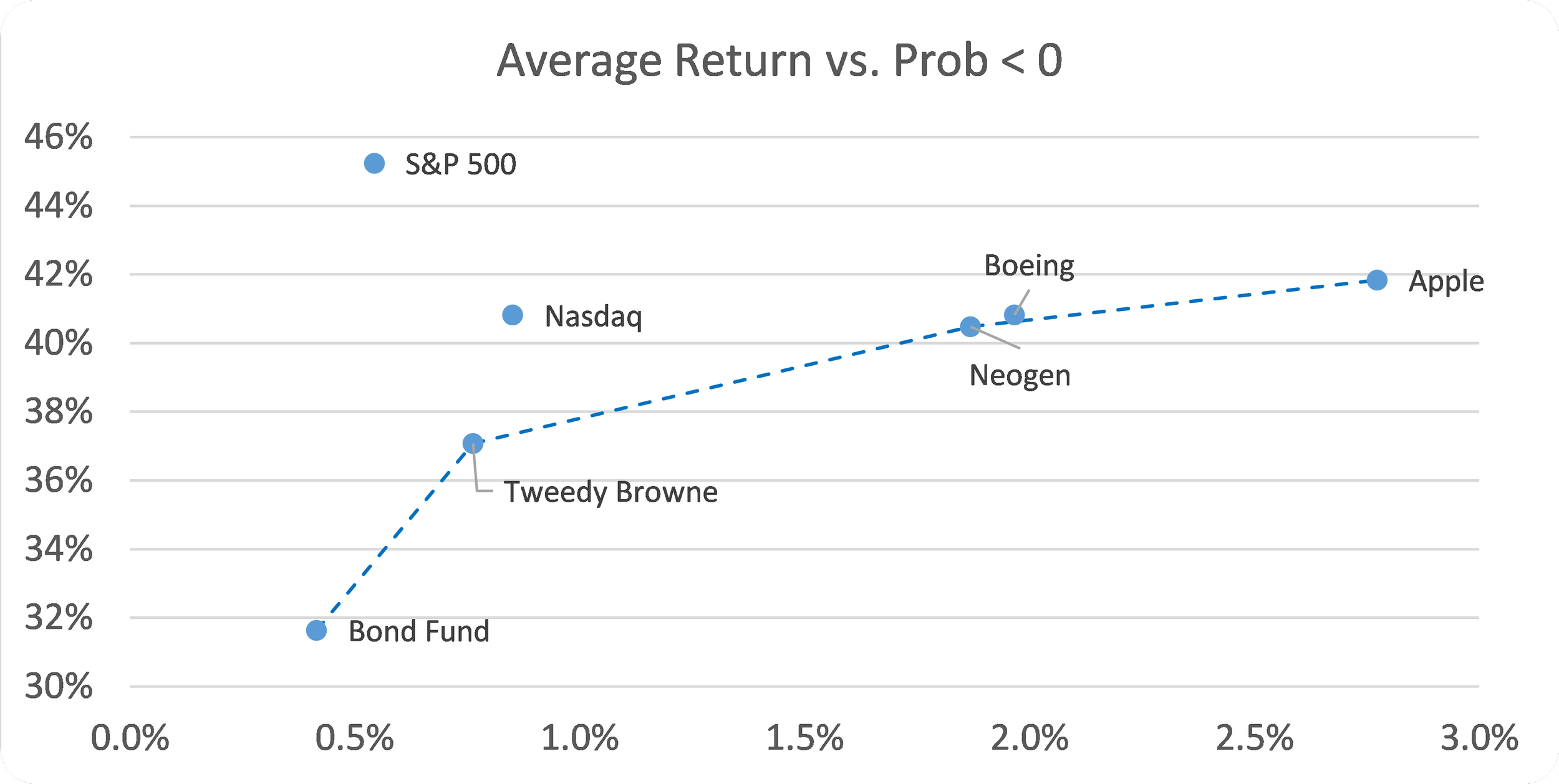
Using the probability the return is less than zero causes the S&P 500 to be even worse relative to the efficient frontier than it was when we used standard deviation. The change in metric also causes Neogen to move down onto the efficient frontier and Boeing to move just slightly above it. These two charts show how our evaluation of the various options can change if we select different metrics.
On a side note, I want to alert you to the importance of looking at the scale of a graph. The scatter plot below is identical to the one above except I have changed the scale on the y-axis. Instead of starting at 30%, it starts at 0%

By changing the scale, I have made the differences in risk look much smaller in the second chart than in the first chart. In my mind, the 31% probability that the monthly return will fall below 0% of the Bond Fund is significantly less than the 42% probability for Apple. The second chart makes it look almost trivial. As you are looking at graphs in any context, you’ll want to be alert for that type of nuance.
Closing Thoughts
The goal of this post was to help improve financial decision-making process by providing insights into a helpful framework. While you may not create graphs such as the ones in this post, you will be better able to think about risk, what features of risk are important to you and how to balance it with reward. These new tools will help you make better financial decisions.